
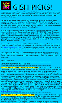
 before |
Gish Picks, a successful weekly e-newsletter for parents published by Gish Creative, already had a faithful following of over 5,000 members when creator Sarah Gish approached us...all it needed was some visual impact. We built upon the existing elements of Gish Creative's imagery, pulling it all together into a bright, crisp and cohesive design to create an instantly recognizable brand for the newsletter. We added visually appealing images to draw the readers in, and make it easy to quickly identify the topic of each piece. The alternating background colors clearly define the transition between segments, helping to guide the readers visually through the newsletter. Reader and advertiser response to the re-design was unanimously positive, generating revitalized interest and resulting in an immediate and significant increase in new subscribers. |
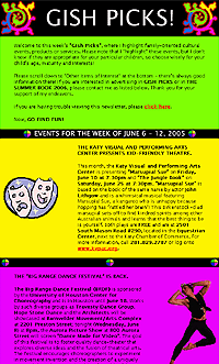 after |
|
"Since my e-newsletter has been re-designed, I have been deluged with new subscribers! I have been doing this newsletter for over a year and haven’t seen this kind of sign-ups since I started. Thanks for your eye-catching work and for helping my business grow!" Sarah Gish, Gish Creative |
![]()
|
|
When we first met with Ron Marks of the Beacon Group, a well-known Houston property development company, he was excited about the prospect of developing a web site, but wasn't sure how to approach the project. They wanted to develop a site and a marketing concept that would both convey the essence of their approach to home design and relate to their familiar beacon logo, but didn't have any clear ideas in mind yet. In addition, they felt it was critical to include professional quality interior shots displaying the high-end features and amenities to prospective homebuyers, but they did not yet have any photographs of their properties. They were working within a budget, and therefore concious of the additional cost required to hire a professional interior photographer. To meet the first challenge, we designed a dynamic and vibrant version of the lighthouse logo with a flashing beacon for the home page of their site, to instill instant brand recognition with visitors. We
also created the "enlightened living" tag line and marketing
concept, finding the perfect words to capture the Beacon Group's development
philosophy of anticipating and meeting the needs of today's homeowners,
and tie in with the beacon logo. We expanded the concept further, writing
the copy to create a page that visitors would be directed to upon entering
the site, but knew we needed to add visual impact by including photographs
of the properties' striking design features.
|
|
With a clear vision in mind of exactly the shots we needed to illustrate the enlightened living concept, we offered to provide digital photography services in addition to developing the web site. After seeing the results of our test shoot, the Beacon Group agreed that we would be able to provide the quality of work and creative eye required to handle this aspect of the project as well. After visiting several locations to photograph interiors, we used the resulting pictures to add visual interest to the site, and created a photo gallery with an interactive slide show feature that provides visitors with a close-up and personal view of the Beacon Group's properties. By coordinating all dimensions of the Beacon Group's site development, including design, marketing assistance and photography, we were able to utilize our unique combination of creative talents to provide them with a well-rounded solution to meet their specific needs, streamline the project, and bring their vision to reality. |
|
|
"West of the World exceeded our expectations by providing us with a cost-effective, turnkey solution to our web development needs. They were willing to listen to our ideas, gave us great creative input, and were very timely, thorough and results-oriented." Ron Marks, The Beacon Group |
| CONTACT US |